Digital Marketing Agencies for Startups: How to Choose the Right Partner
Compare digital marketing agencies for startups, SEO-only vendors, and AI-native visibility partners to decide what fits your launch stage.
Read →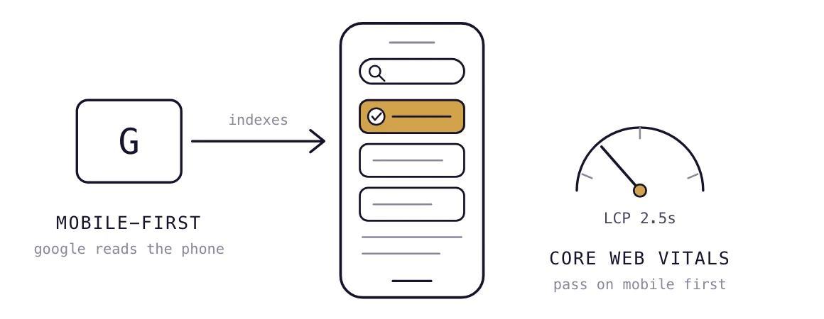
Mobile SEO in 2026 goes beyond responsive design. Your mobile site needs to be fast, easy to navigate, technically accessible to search engines, and just as complete as the desktop experience. Google uses the mobile version of your site for indexing, so missing content, poor performance, or usability issues on mobile can directly affect your organic visibility.
The 11 practices below cover the areas that matter most, from Core Web Vitals and mobile-first indexing to content, rendering, navigation, and local search. Start with the technical foundations first. There's little point optimizing headings or keywords if Google cannot properly crawl or render your mobile pages.
Mobile SEO is the process of optimizing your website for search performance and usability on smartphones. It combines technical SEO, page speed, content, and mobile UX to make sure your pages work well for both search engines and users. Because Google primarily crawls and indexes the mobile version of a site, your mobile experience is now a core part of your SEO strategy.
Google primarily uses the mobile version of your site for crawling and indexing, so mobile and desktop should contain equivalent content and important SEO signals.
Mobile SEO covers technical performance, content, and mobile usability. Responsive design is one part of that process, not the whole thing.
A responsive site automatically adapts its layout to different screen sizes. Mobile SEO goes further by making sure the mobile version is fast, crawlable, renderable, complete, and easy to use.
Google is using Googlebot Smartphone as the primary crawler for mobile-first indexing since 2023. That means important content and links that are missing from the mobile version may not be available to Google in the same way they are on desktop.
Mobile-first indexing means Google primarily uses the mobile version of your content when crawling and indexing a page. If your mobile page contains less content, different internal links, or missing structured data, Google may not see the same page you see on desktop.
This makes mobile and desktop parity an SEO issue, not just a design consideration. Your mobile version should contain the same important information and SEO signals as the desktop version.
If you are already working on broader technical SEO, an SEO and GEO website optimization audit can also help identify issues that affect how search engines and AI systems access your site.
Start with page performance, crawling, rendering, and URL configuration. These determine whether search engines can access and understand your mobile pages.
1. Pass Core Web Vitals on mobile. Target LCP under 2.5 seconds, INP under 200 milliseconds, and CLS under 0.1. [LCP measures how quickly the main content loads, INP measures how quickly the page responds to user interactions, and CLS measures how much the layout shifts unexpectedly.] Test the mobile version specifically in PageSpeed Insights rather than assuming desktop performance reflects what mobile users experience.
2. Check what Googlebot Smartphones can actually see. Use Search Console's URL Inspection tool to check the indexed version of your page. Compare the rendered mobile page with what users see on an actual phone. Important text, links, images, and other content should be available to Google without relying on broken scripts or blocked resources.
3. Use responsive design instead of separate mobile URLs. A responsive layout lets the same URL serve the page across devices. Separate m-dot URLs create additional redirects, canonicalization requirements, and opportunities for mobile and desktop versions to fall out of sync.
4. Make sure JavaScript does not hide important content. Google can render JavaScript, but rendering problems can prevent important content or links from being discovered or understood. Avoid making essential page content dependent on interactions or scripts that fail to load.
5. Fix mobile-only redirects and 404 errors. Test important URLs on mobile to make sure they resolve to the correct equivalent page. Avoid sending mobile visitors from a valid desktop URL to the homepage or another unrelated page. Check your redirects and 404s in Search Console and during a mobile crawl.
6. Compress images and defer offscreen resources. Use modern image formats such as WebP or AVIF where appropriate, size images correctly, and lazy-load images that are below the fold. Keep the main content and LCP element from being delayed by unnecessary resources.
A slow mobile page isn't always an image problem. Fonts, third-party scripts, and JavaScript can block the main content too. Check what's actually delaying the render before deciding what to optimize.
Once the technical foundation is working, check whether the mobile page contains the same information and SEO signals as its desktop counterpart.
7. Match important content between mobile and desktop. Keep important copy, headings, internal links, images, and other relevant content available on mobile. Content can be placed inside tabs or accordions when the interface is useful, but don't remove important information simply to make the mobile page shorter.
8. Set the viewport correctly and keep text readable. Use a proper viewport meta tag so the page scales correctly on mobile screens. Body text should be comfortable to read without requiring users to pinch and zoom.
9. Keep structured data consistent across mobile and desktop. If structured data is present on the desktop version, make sure the mobile version contains the same relevant markup. Test the mobile URL with Google's Rich Results Test rather than checking only the desktop page.
Mobile usability affects how easily people can interact with your pages, while local optimization helps businesses capture searches with strong mobile intent.
10. Size tap targets for thumbs, not cursors. Make buttons and links large enough to tap comfortably and leave enough space between adjacent controls. A commonly used target size is around 48 × 48 pixels.
11. Avoid intrusive interstitials and make local actions easy. Don't cover the main content with a large pop-up immediately after someone arrives from search. For local businesses, keep your name, address, and phone number consistent, make phone numbers tap-to-call, and provide clear directions or location information.
For businesses targeting local customers, see our complete guide to local SEO for a broader look at local search optimization.
Test important mobile pages on an actual phone, not just a resized desktop browser. Real devices expose issues with tap targets, scrolling, font sizes, and page speed that a desktop preview can miss.
A useful mobile SEO checklist should pair each practice with a reason to check it and a simple way to verify it.
| Practice | Why It Matters | Quick Check |
|---|---|---|
| Core Web Vitals | Measures key aspects of mobile page experience | PageSpeed Insights, mobile test |
| Mobile-first indexing | Google uses mobile content for indexing | Search Console URL Inspection |
| Responsive design | Keeps one URL consistent across devices | Check mobile and desktop URLs |
| JavaScript rendering | Prevents important content from being missed | Inspect rendered mobile page |
| Mobile redirects and 404s | Keeps mobile visitors on the correct URL | Crawl important URLs on mobile |
| Image optimization | Reduces unnecessary loading time | WebP/AVIF, correctly sized images |
| Content parity | Keeps important information available on mobile | Compare mobile and desktop |
| Viewport and readability | Makes pages usable on small screens | Viewport tag, readable text |
| Structured data parity | Keeps search features consistent | Rich Results Test |
| Tap-target sizing | Makes navigation easier on touchscreens | Test buttons and links on-device |
| Interstitials and local UX | Prevents blocked content and friction | Test pop-ups, calls, directions |
Start with the problems that can prevent Google from properly accessing or understanding your pages.
Run PageSpeed Insights on your key mobile pages, then use Search Console's URL Inspection tool to check how Google sees them. Next, compare your mobile and desktop versions for missing content, links, structured data, redirects, and rendering issues.
Once the technical problems are fixed, test the experience on a real phone. Check navigation, tap targets, text size, pop-ups, forms, and important local actions such as phone calls and directions.
If you want to monitor SEO performance continuously instead of relying on one-off audits, see our guide to automated SEO monitoring.
Don't judge your mobile site by resizing a desktop browser window. Use PageSpeed Insights' mobile test and a real device. A page can look fine in a desktop preview while still being slow or frustrating to use on a phone.
The most important areas are Core Web Vitals, mobile-first indexing, content parity, crawlability, rendering, and mobile usability. Responsive design alone does not cover all of them.
Google primarily crawls and indexes the mobile version of a page. If that version is slow, difficult to crawl, missing important content, or hard to use, your mobile experience can limit both search performance and user engagement.
Use responsive design, make sure Google can render your important content, keep mobile and desktop content equivalent, optimize Core Web Vitals, and check mobile URLs for redirects and errors. Then test the experience on a real device.
Core Web Vitals, mobile-first indexing, crawlability, rendering, content parity, responsive design, structured data, and mobile usability are the main areas to check.
Google uses the mobile version of a page as the primary version for crawling and indexing. Mobile-specific problems can therefore affect what Google is able to access and understand about a page.
A mobile SEO checklist is a list of technical, content, and usability checks for your mobile site. It should cover performance, crawling, rendering, content parity, structured data, URLs, and mobile UX.

Compare digital marketing agencies for startups, SEO-only vendors, and AI-native visibility partners to decide what fits your launch stage.
Read →
What a saas content marketing agency does for AI-built sites, how to pick one, and where GEO/AEO fits. A practical buying guide for founders.
Read →
A practical framework for founders choosing an international SEO service: what agencies actually do, what it costs, and a checklist before you sign.
Read →Hand over a domain. Research runs and your first article is written within the hour.
Start free trialCancel any month. Your site and content stay yours.